Things to Remember When Creating PowerPoint Presentations
TABLE OF CONTENTS
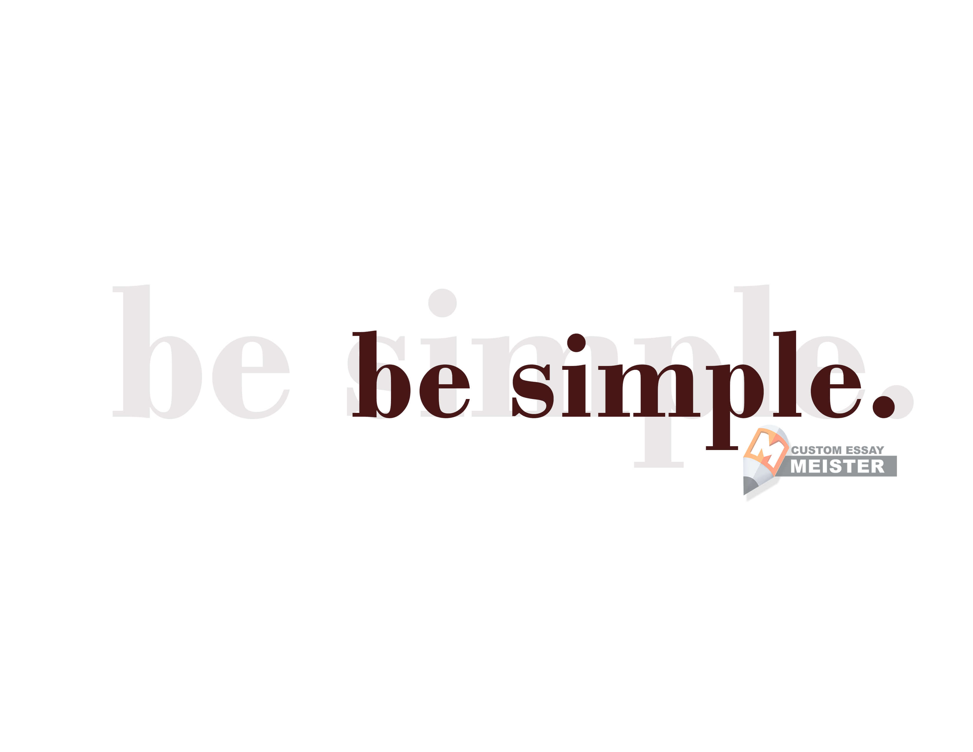
Be simple.
Choose space over words.
Limit your animation and transition.
Take the supporting image business seriously.
Careful on your charts.
Decide on a theme and stick to it.
Utilize the slide sorter.
Communicate with your audience.
Follow a script.
Utilize the slide notes.
Writing assistance for college students
There are only two things that can fail your presentation – one, your visuals look exactly like your essay: words and words on top of more words, and two, you are talking to your audience like a recorded robot, reading whatever that is on your slide and on your notes. At some point, we all might be guilty of committing these atrocities, one or tragically both at the same time leading to your audience not understanding anything that you just said, and believe us, you do not want that. Avoid the boredom in the room and make sure to kill the stage with these ten things that you need to remember when creating and delivering
PowerPoint presentations:
Be simple.
This is the golden rule – may be even to life and all things other than creating your PowerPoint presentation. Stick to colors that are not blinding and avoid those curvy fonts. Why? Because no one can understand what is written in your slides if you use bright colors and highly stylish fonts. Keep in mind that you are the closest to the screen, understand the distance of your audience, and adjust your visual keys to their needs. Let the contrasting colors work its wonders - if your background is light, opt for a dark text and vice versa - it is that simple.
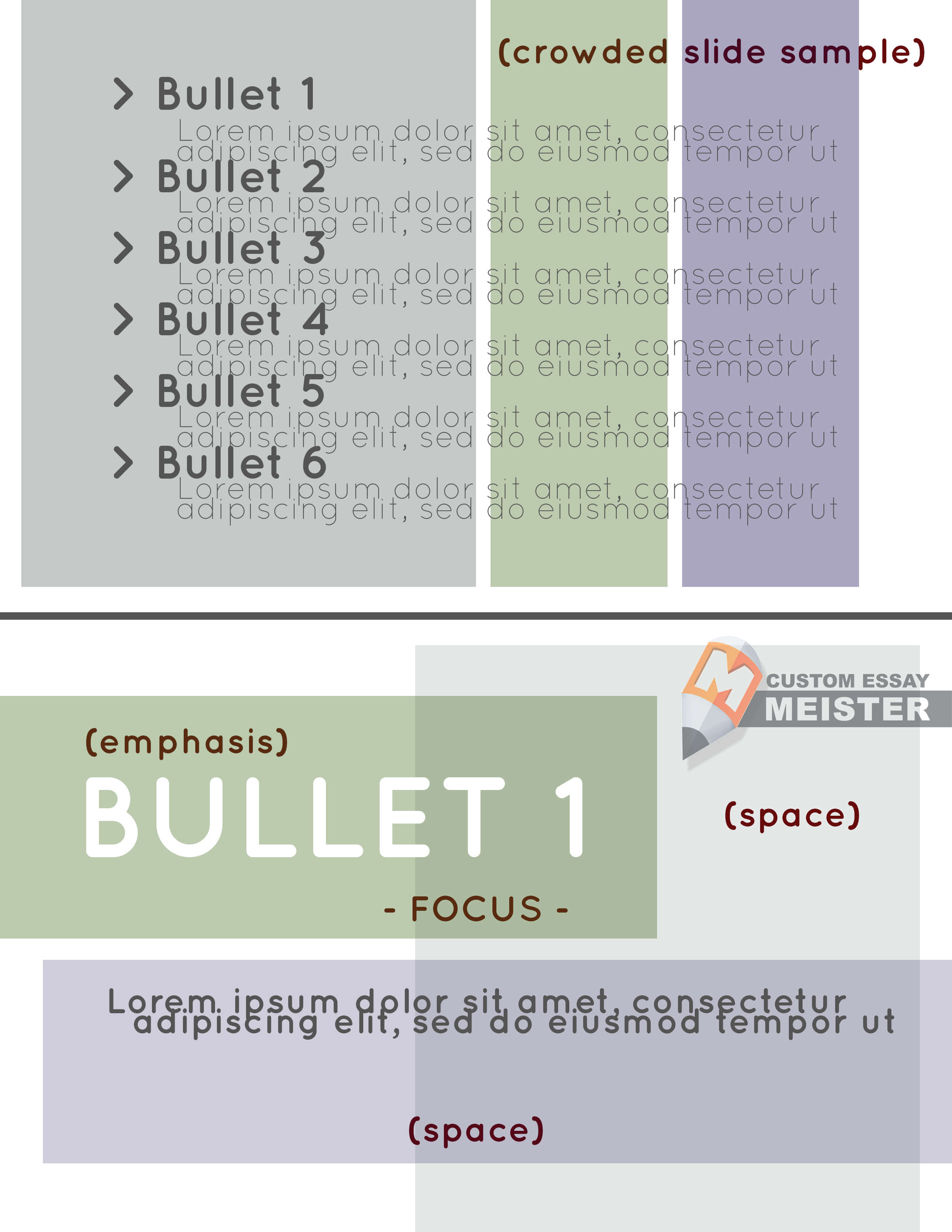
Choose space over words.
Again, cluttering your slides with text and making them appear like an on-screen essay is equivalent to 50% chance of failing your presentation. The truth is no one wants to hear you say what is already in your slide. Use bullet points if you have to, but the point is, this is called “PowerPoint” presentation for a reason – you just have to highlight the most important points of your topic, the rest should be discussed by you.
Notice the differences between the first and second slide (top image versus bottom image) - the first slide contains so much information making it cramped and difficult to read, while the second slide contains only the first bullet point, and it is your job, as the presenter, to expound on this. The empty spaces in the slide pushes the focus of the audience to the text.
Limit your animation and transition.
It may appear quite amusing at times knowing that your next slide will come twirling into the projected screen. The problem is you do not need that. Imagine being seated at the very end of a symposium crowd, would it be helpful for you to witness texts and slides flying in and out of the screen, considering that you are already having trouble reading its content? Take it from us - the only transition that you need is the verbal transition from one slide to another, and you have to think about that like how you would think about your next move on chess, because you have to keep the attention of your audience. Above all, animated transitions decrease the level of formality and sophistication of your presentation.
Take the supporting image business seriously.
Unless your presentation is on the historical evolution of imaging, please stay away from pixelated images and/or built-in clip arts. Those you can find in your MS were very interesting in 90s, but times have changed, and simplicity is taking its crown back. There are a number of websites offering free stock photos which you can utilize for your presentation. We only have three rules for you:
a. Download free photos (to avoid copyright issues) which are of high resolution (to avoid emphasis on pixels);
b. Never stretch just one dimension of your photo - if you need to resize it, adjust both the height and width of the photo; and
c. Choose images that can be easily laid out with text - in short, go back to rule number 2.
Note that your visual designs must match your topic. Great images can serve as your background, and that is way better than utilizing built-in PowerPoint themes. For instance, if you are discussing gastronomy, you can find images of food which space is enough for you to add text.
Careful on your charts.
When presenting with charts, you cannot simply choose a bar chart because you think it will look good on the slide - you have to carefully evaluate the elements of your chart, then choose the best graph to represent your figures. As a quick guide:
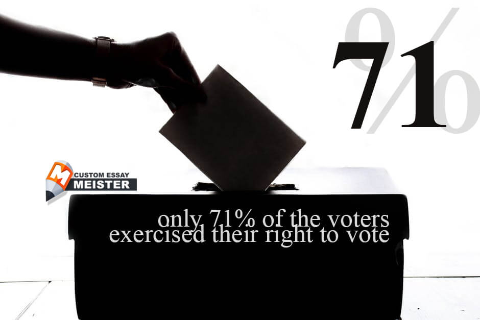
a. Pie Charts - Pie charts are used to represent percentages which make them the best tool to present, for instance, the division of votes for political candidates; b. Bar Charts -
A bar chart is the best tool to present a comparison on quantities which can be reported through two elements - for example, you wish to compare the sales of a product from July to December of 2018 to that of July to December 2019. However, keep in mind that bar charts will not be as effective if you try to squeeze in too much details;
c. Line Charts -
To present a progress or changes of, say, sales or response, line charts are the best tool because it can give you a dip and a rise in one look, however, like bar charts, line charts work better with limited data;
d. Tables -
Utilize a table if you must, however, make sure that you can simplify the data to its most reduced form. Your audiences will not see them anyway if you try to squeeze in hundreds of figures in one slide.
So, what is the best solution if you think you cannot fit any thing into any of these charts? Choose to utilize the space. Note that simple images work better than tables or any graph because there is no need for the audience to decipher various figures. Again, rule number one, keep it simple.
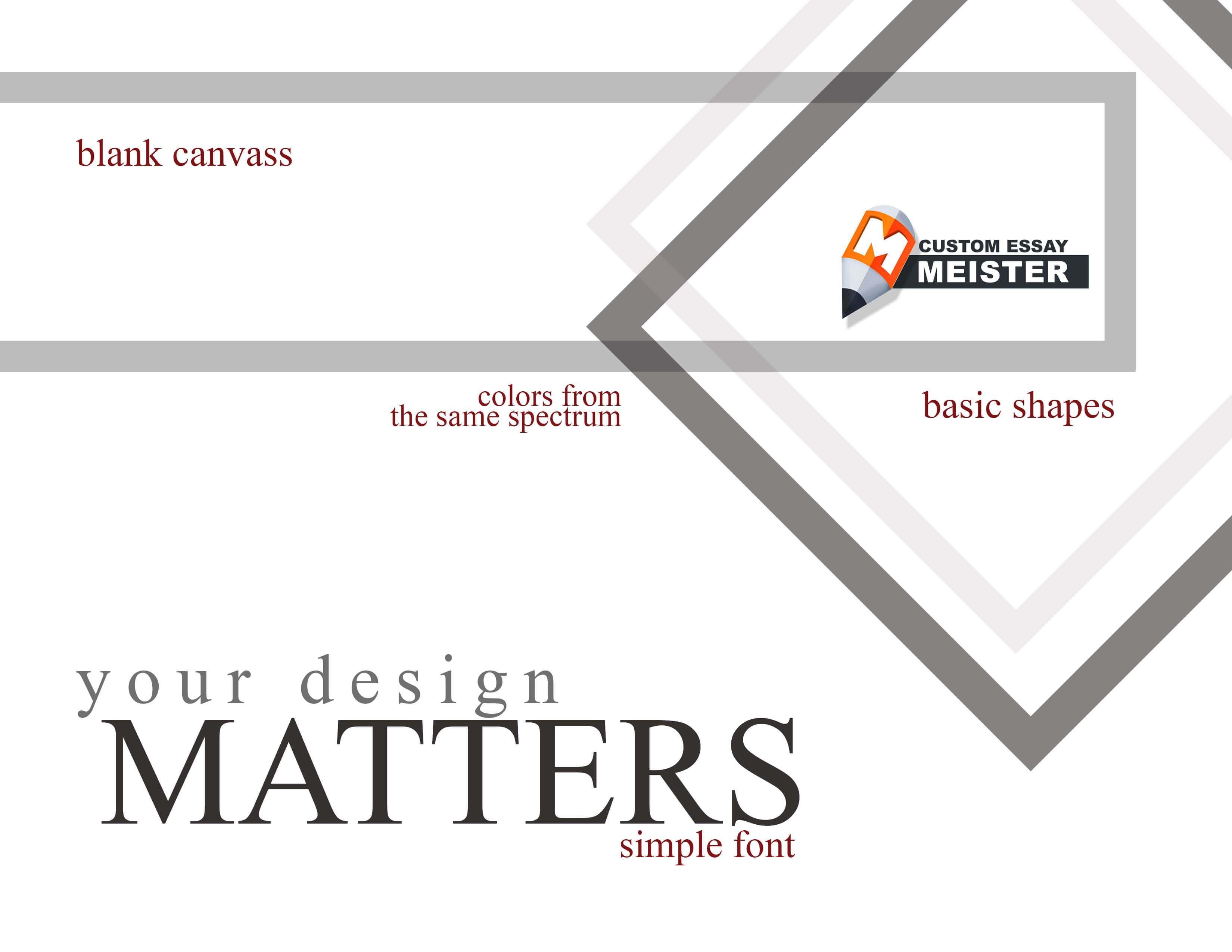
Decide on a theme and stick to it.
Believe it or not you can make black text and white slide with just small details your theme, and it will look awesome. Sticking to a theme allows your audience to condition their minds that you are still talking about the same topic, and that you are still in the same line of thought as you are supposed to be. Changing from one theme to another can disrupt your audience's flow and yours as well. You can choose any theme you want, even those that are built into your software, but we at CustomEssayMeister suggest that you walk the extra mile and shy away from those because chances are they have seen those themes a hundred times before, and you do not want to create the impression that you were simply not that willing to make the effort of creating your own. Take a look at the following slides:
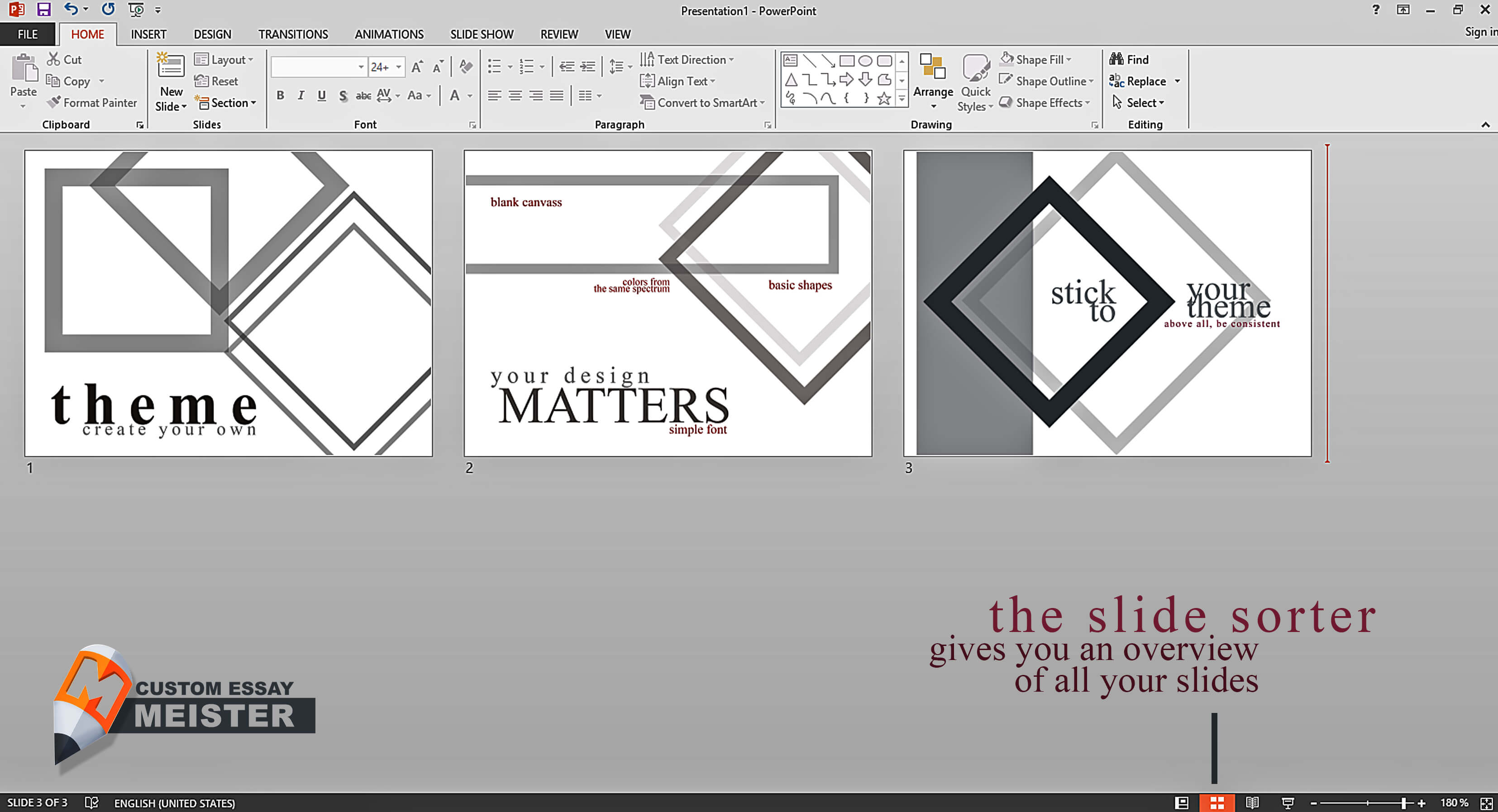
Utilize the slide sorter.
The slide sorter allows you a bird’s eye view on your slides which means you can double-check your slides if they flow logically. This can also help you decide on the best transition from one slide to another.
Communicate with your audience.
There is a huge difference between talking and communicating – talking does not necessarily involve a feedback, whereas in communicating, there is a reaction coming from the receiver thereby interchanging the sender and receiver roles to the speaker and the audience. Furthermore, allowing your audience to send you a feedback strengthens your connection with them, consequently ensuring that you have their full attention. Ask questions and let them ask questions.
Follow a script.
Your slides should only complement what you are saying, and never to be entirely what you got to say, because if that is the case, you might as well give them a copy of your presentation. You need to discuss your topic, and a script can help you a lot.
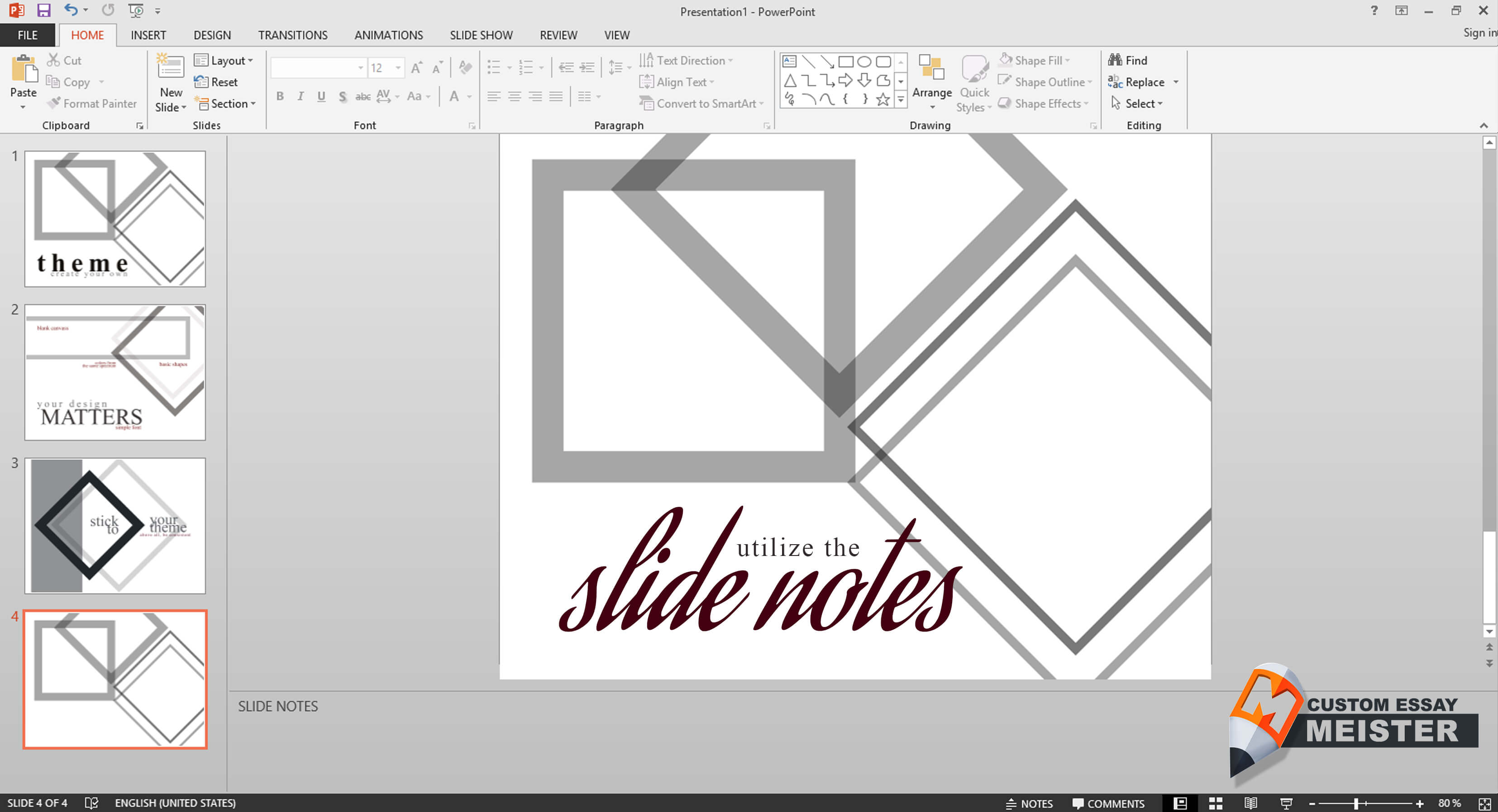
Utilize the slide notes.
Sure, a good old little index card on your hands can help you keep track of your discussion, but PowerPoint has a feature which you can use to remind you important details about your report. The slide notes are only visible to you, the presenter. Watch the video below for more tips or let us help you.
Writing assistance for college students
Knowing how to create a PowerPoint presentation is a task unlike any other. While it is similar to other academic papers in its need to be written impeccably, the difference lies in the challenge to write in a concise manner and the forced activation of one's aesthetic sense. The writing part can pass off as easy to some, but designing slide after slide? Not so much. Possession of an acute aesthetic sense is one thing, but the proper application of which in creating a PowerPoint presentation is another. Because of these, only a select number of people can do both without any hitches. Here at CustomEssayMeister, we can do both with such ease. Make no mistake, we are a ghost writing company, but it does not necessarily mean that the scope of our abilities are bound by our name. Our writing help consists of essay help, research paper help, PowerPoint presentation help, and all kinds of academic paper assistance. We're a message away if you have a hard time preparing your write-up and designing your slides, we can help.